


THE IMPORTANCE OF BRAND COLOURS
Brands and colours are indistinguishably linked – Golden Arches, Sainsbury’s orange, Tiffany blue or Breast Cancer’s pink ribbon. Colours create a vibrant visual experience making things more attractive. They have an affect on our mood and can even subconsciously shape an action so, as a result, brands put a lot of thought into the colours they use.
The average person makes a subconscious judgment about a product, person or the environment within 90 seconds. More than two thirds of that judgment is based on colour, that’s a fact!
That said, individual experiences, upbringing, cultural differences, and context can also shape our response to colour. For example, in the UK, white is closely linked with weddings, whereas in India, white is worn when someone dies.
Some colours, however, evoke universal emotional responses. A great example would be the colour blue, which conveys honesty, trust and dependability. Blue is often used in logos, such as Facebook, Twitter & LinkedIn.
Brand colour associations include:
- Pink/Purple: Feminine, fun, youthful – frequently used to promote beauty products.
- Green: Good, healthy, organic – and can be used to convey relaxation, nature or environmental issues.
- Red: Designers use red in high-energy context; often to convey a sense of urgency or boldness. Think of all those SALE signs you see on the high street.
- Silver: Sophistication, class, with a little bit of mystery around it.
- Black: Elegance, boldness, power, sophistication.
- Orange: Fun, warmth and enthusiasm.
- Yellow: Cheerful and optimistic.
International brands like McDonalds use high-energy colours like red and yellow, which convey the same feeling of activity and cheerfulness no matter which country you’re in.
How to Choose the Right Colour Palette for Your Brand
The first step to choosing the right brand colour is to establish your brand’s voice and feel. To help, consider where your brand falls in the list of colours above. With that context in place, brand colours will be much easier to pick. Here are a few tips to help you choose the right colours for your brand:
- Start with one colour that conveys your style or voice. If you have a logo, use the dominant colour in your logo as your first primary colour. Afterwards, add one more primary colour, a secondary colour, and an accent colour.
- To make sure your brand colours remain consistent, create a style guide with hex values. Also be sure to define different background colours and grayscale. This will help down the road when you expand your range of visuals and design.
- Aim to use a maximum of four colours. You can add some variety by using different shades and tints of those four colours.
- Repetition is key to success when it comes to establishing a well-known colour palette for your brand. Use your colour scheme everywhere in your marketing. This includes your marketing and sales collateral, your brand’s site and social channels, and more.
- Remember to avoid confusion with other brands by staying away from your competitors’ colours. This will help you stand out to prospective customers as a unique and memorable offering.
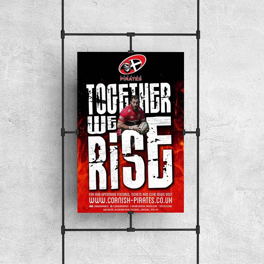
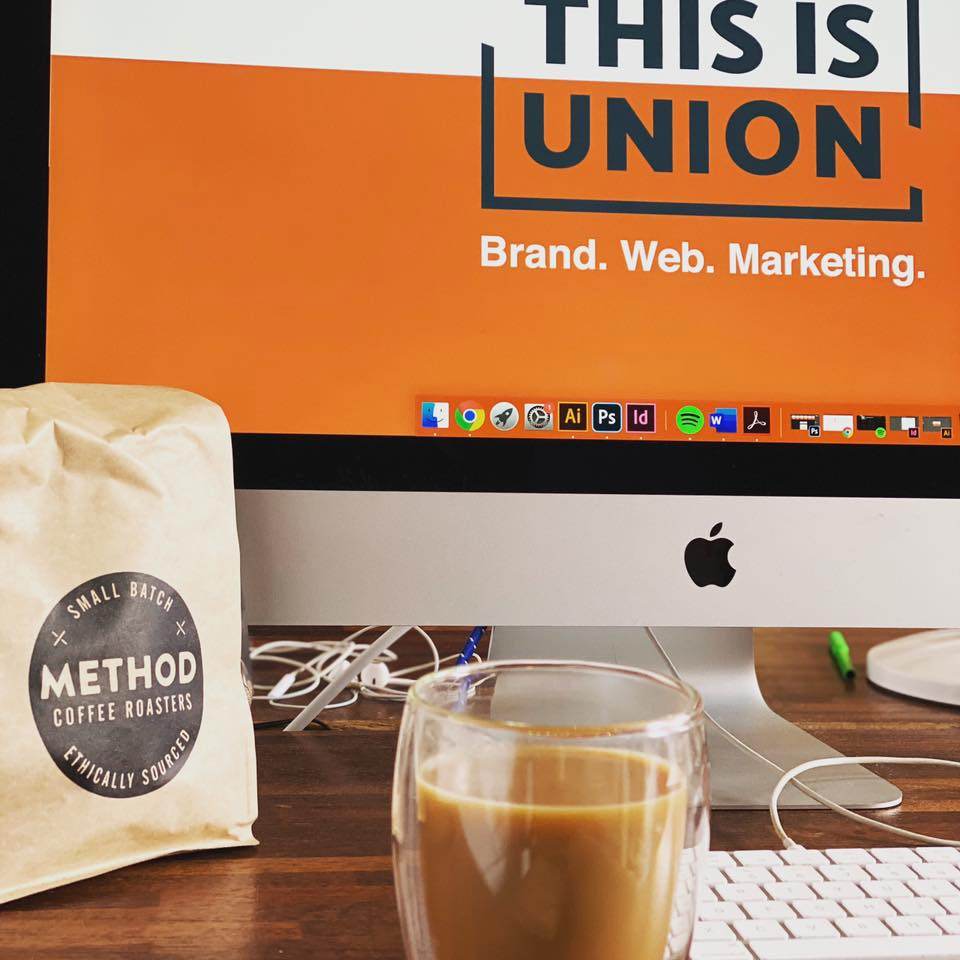
Please take a look through our portfolio for examples of where we have put all this into practice.